Tracking Health and Wellness Programs
Healthentic wanted to increase user engagement with the Population Health Dashboard reporting product. Through user research, we discovered an unmet need that could also increase customer-product interactions, so we designed a tracking feature to match.
Highlights
- Created a project plan and received buy in from company executives and subject matter experts.
- Recruited, screened, and conducted user interviews with six customers and three potential customers.
- Analyzed transcripts and notes, collaborated with team to create customer journey map.
- Proposed and iterated design solution through paper prototyping and wireframes.
- Teamed with account management to create a roll out plan that was congruent with existing practices.
- Worked with developer to create functional prototype with Google Visualization API.
- Tested and iterated design with customers and internal stakeholders.
- Created and managed UI requirements and development backlog.
- Successfully launched tracking feature.
My Role
I managed this project from end-to-end. I was responsible for research and discovery, final prototypes, UI documentation, and the story backlog for development. I worked collaboratively with product mangers, subject matter experts, and executives throughout the project. Team members contributed to customer interviews, analysis, journey mapping, and prototyping.
Problem
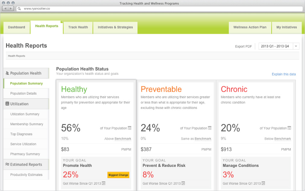
The business goal of this project was to increase engagement. Healthentic’s Population Health Dashboard provided a great deal of reporting in a simple, easy to use package. It solved the problem of untimely, disparate health data for human resource administrators and benefit managers. Although customers regularly renewed the service each year, usage was sporadic even as users told us that they liked using the product.
Process
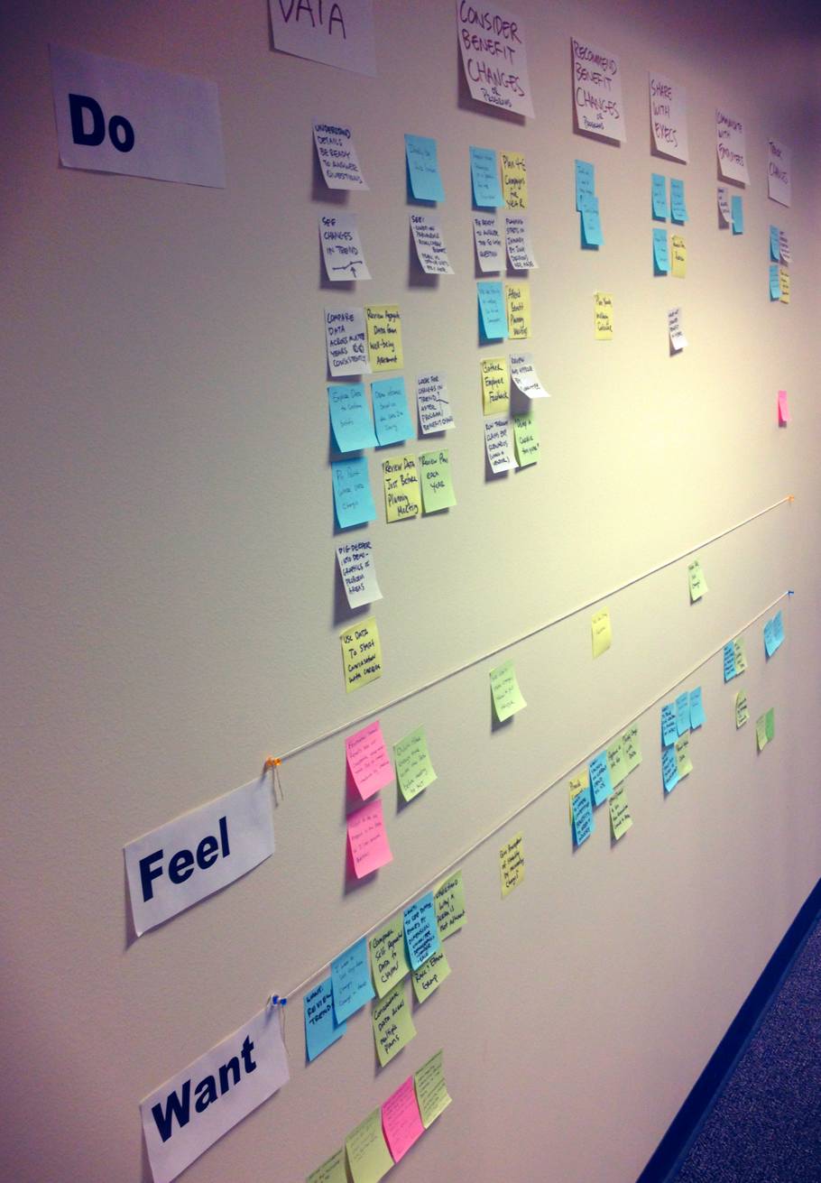
Finding a viable way to increase user engagement meant we needed to learn more about the users current behaviors. I screened, recruited, and conducted ethnographic interviews to learn about benefits planning. Using a set of question prompts, our team learned about a yearly benefits planning cycle. We organized and collected the research data in a customer journey map.
Through this research we learned that users had a difficult time tracking their benefit changes and programs. They kept detailed spreadsheets, but they weren’t usable. It was difficult for users to draw connections or inferences about their program efforts and their data. This was an opening to solve a problem that was both consistent with users’ past behaviors and could meet the goal of increasing engagement with the product.
Hypothesis and Creative Brief
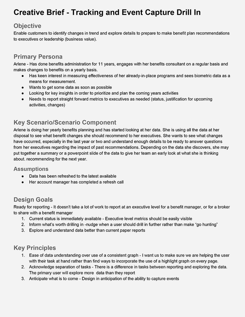
Our hypothesis was that users wanted a way to quickly and consistently understand health outcomes related to their programs and benefit changes. We would create a tracking function that would allow users to quickly capture their changes, events, and programs to catalog and visualize them against their live data. This would give users a reason to login and use the Population Health Dashboard on a regular basis. Before getting totally immersed in the design of the new feature, I wrote a short form creative brief to get the team on the same page. This provided a way to keep the project focused on the key user scenarios at the forefront of our design work.
Prototypes and Early Testing
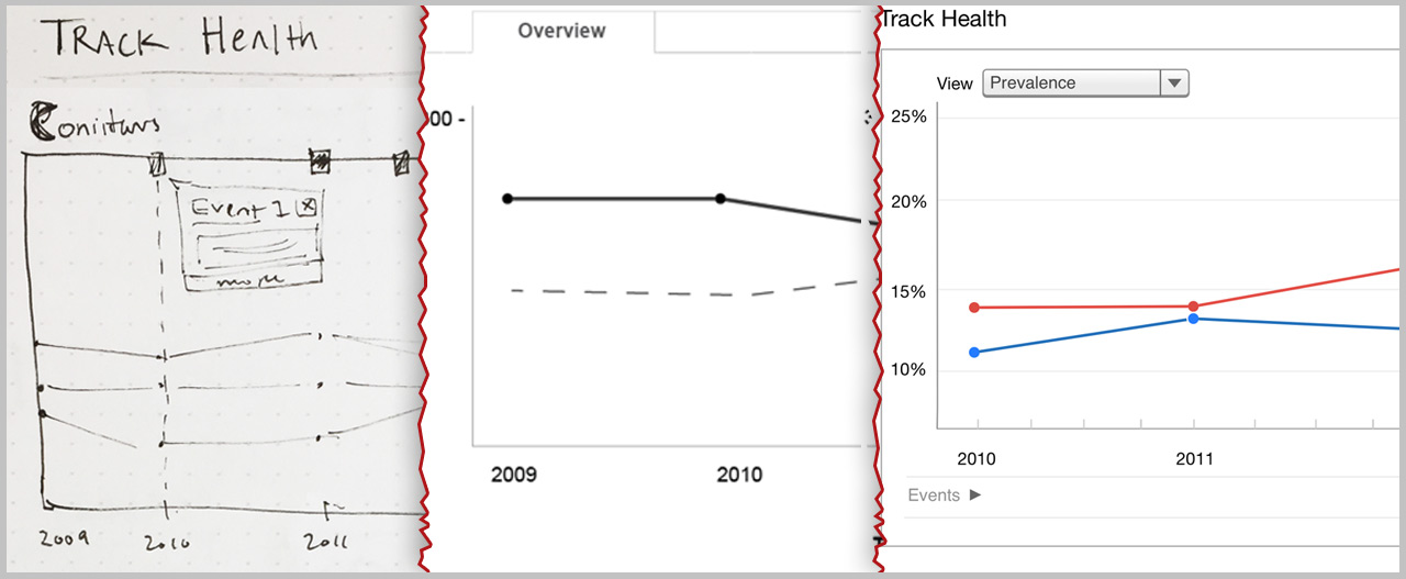
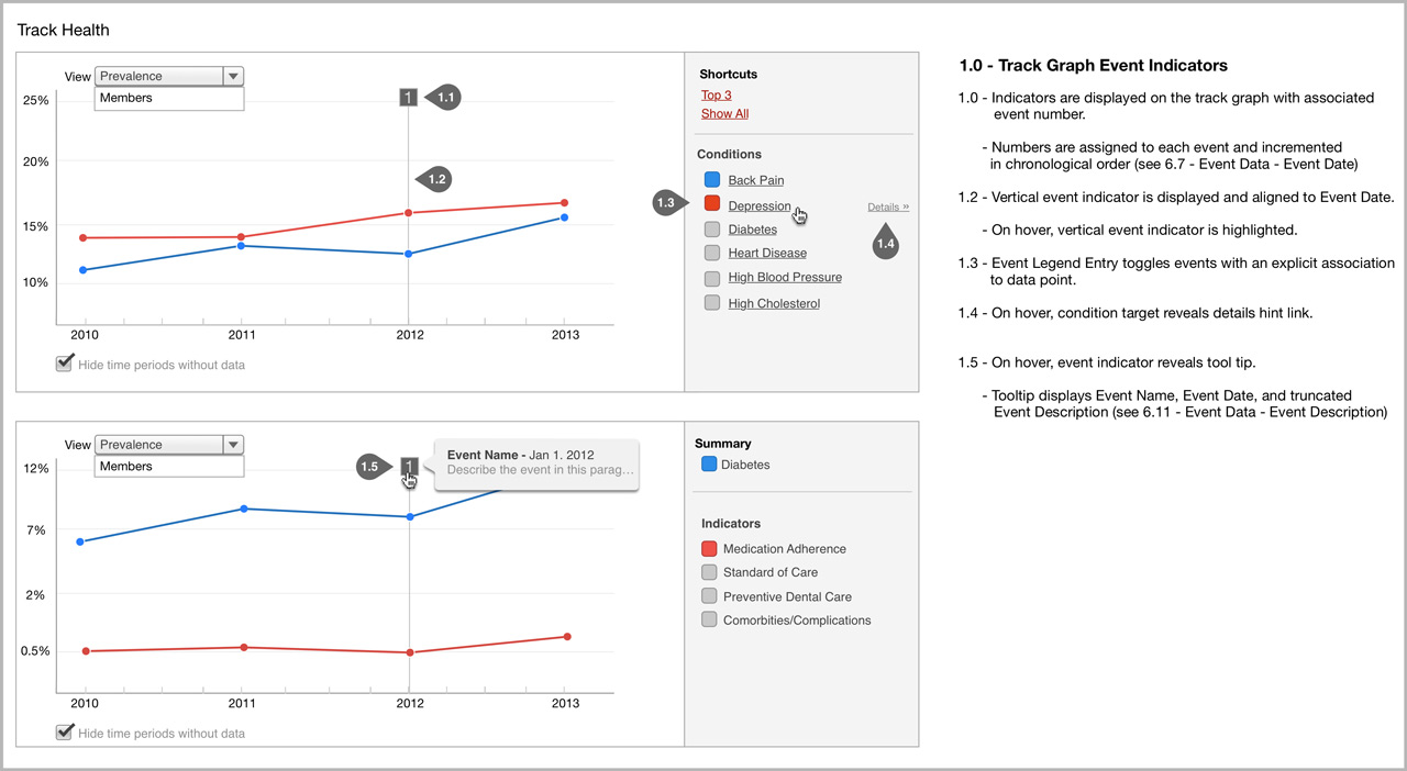
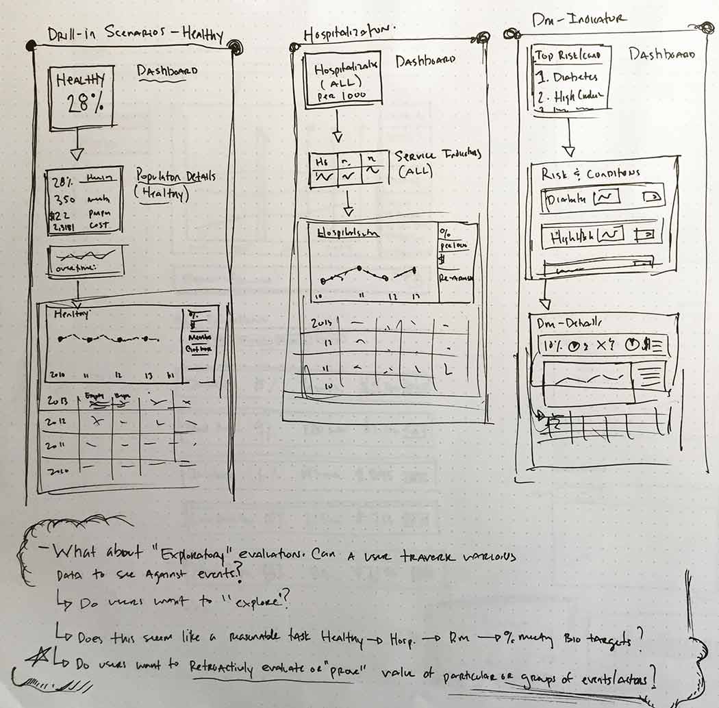
I progressed from white board sketches and paper prototypes all the way to requirement and implementation. As design problems were tackled, the fidelity of our artifacts increased. First, the focus was on only a few key screens that users would interact with most. Our testing focused on these designs first. We would work out detailed interactions and edge cases later.
There were a number of challenges given the existing product—such as variable data availability and the current implementation of “time periods”—that provided constraints to ultimately help focus the design on the highest priority user scenarios and tasks. As the design progressed, I did cognitive walk-throughs with customers and our internal team to make sure we were on track, making changes as needed.
Don’t Forget the Overall Experience
This product change also introduced a new level of “drill in” functionality that would be available throughout the application. To address this, I also had to consider the broader implications for the information architecture of the product. How would the addition of event tracking affect data displays on the product dashboard or influence important user tasks flows we were already supporting?
Outcomes
218 tracking events were captured by users in just the first two and half months after the feature was made available in Q3 2014.