Socrata Visualization Authoring
Designed and launched a new visualization authoring experience tuned for Socrata user scenarios. The experience was designed to have entry points throughout the platform and provide a balance between ease-of-use and capability. Users have created just over 2300 visualizations with the new experience since March of 2017.
My Role
I was the lead designer on this project. I worked alongside a product manager and an engineer to design, prototype, test, and iterate the earliest versions of the product. I created numerous drawings, sketches, wire flows, leading to high-fidelity designs. Finally, I worked in code alongside our engineer to polish the interface, interactions, and visualizations themselves. Throughout the project I conducted user testing, collected internal feedback, and incorporated what we learned back into the designs.
I was also paired with a product manager to work out the rollout for customers, launch a technology preview (beta), and figure out how to migrate users from the “classic” Socrata visualization experience to this new and updated product. Shortly after the tech preview was launched, I transitioned from a lead to a support role on the project.
Problem
Visualization authoring is one of the primary components of the Socrata data platform. Through the years, we had built and re-built a variety of visualization tools, but never really found the right balance between ease-of-use and capability. There were a lot of issues to grapple with in this space, but I’ll summarize the problems we wanted to address through this project:
- The business incurred a lot of cost in maintaining two visualization experiences that served related, but different needs.
- The newest of the experiences, Data Lens, was purpose-built and did not provide the customization options desired for authoring visuals; most users never used it because it didn’t solve their problem.
- The “classic” visualization experience had been unchanged for many years, so customers perceived Socrata as not making forward progress on the data visualization tools they cared about.
- New and important user scenarios had come to light since these product areas were created and neither—from a technical nor experience viewpoint—fit well into the new use cases.
- A visualization experience needed to be used in a variety of contexts, so any solution had to account for a range of possible entry points.
- The two existing surface areas for visualization created inconsistency and confusion among users, not to mention uncertainty when it came to the product roadmap for visualizations.
- The mechanics of the visualization objects—that is, the object attributes, behaviors, and relationship to users and other system objects— were problematic across each toolset currently in the hands of users.
Our goal was to rationalize, unwind, and define a path forward for data visualization tooling on the platform as well as ship something incrementally that would start us on the path to solving the larger problem set.
Process
As with many complex projects, the place I like to start is back at understanding why a product needs to exist and what problems it solves for which users. To look at this I dove into all of the user testing, research, instrumentation data, customer surveys, support ticket data, feature requests, and product rationale documents I could find. I also spent a great deal of time with our engineering and product team to understand why a “third” experience would be better than improving one of the existing areas. Based on these investigations, the product manager and I generated a few insight hypotheses about Socrata’s offering in data viz:
- Data visualization tools are a commodity; we get a near zero return on investment from “innovating” on the visualization itself. We should focus on standard visualizations, tuned for users’s large, transaction-level datasets.
- Users spent a massive amount of time popping in and out of various data shaping, visualization, and loading tools so they could get their data to work as a chart. The experience should bring some amount of these tools together to improve a time and task intensive process.
- Users often knew exactly what they wanted, until they realized it wasn’t at all what they wanted. The configuration experience should make for quick work so users could easily experiment and iterate.
- Users of the Data Lens experience often removed all but one or two of the “automatic” visualization cards in order to start from a clean slate and “create just the charts [they wanted]”. Users want more control over their visualizations from the get go.
- Users often created Data Lens visualizations in order to filter the data. Customers wanted a filtering experience up front; one that they could use to shape and get visual feedback on their data at once. Note, that this not a new idea, but had been a not-yet-implemented desire of the Data Lens design team for some time.
- There was a very long tail of features that we could remove from the product to reduce complexity and cost without reducing customer happiness with the tools available.
- We can successfully deprecate the “classic” visualization experience given users have a way to customize their visualizations and there is a path to migrate their classic visualizations to any new technology.
Research
Using our hypotheses as a basis for investigation, we started out by talking to many of the vocal users of Socrata visualizations—both government analysts and and users from our own customer success team. I then conducted usability tests of our existing software. After developing an interview guide, task matrix, and test script I jumped right in to testing. I ran 12 users with the “classic” experience as well as 8 users with the Data Lens experience. We used those testing sessions to further interview participants about the data they selected for visualization testing, what they intended to do with it, and to learn more about their expectations when it comes to visualizations.
One thing we learned was that the speed at which users could get to a visualization on Data Lens was great, but it did not provide enough basic customizations to make the chart presentable outside of the Data Lens context. Users wanted to trim off some data, adjust the orientation or axis and then place it on a webpage or a Socrata Perspective page. None of which they could do.
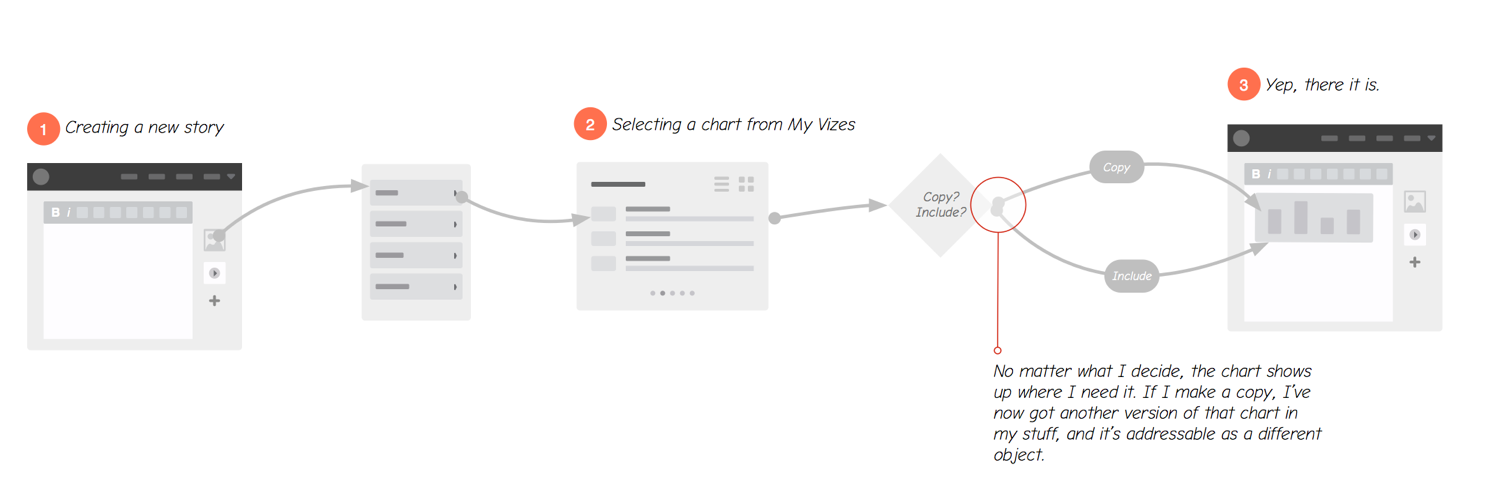
Users were also frustrated with the way Data Lens objects were treated on the platform; similarly, they disliked the relationship between ‘datasets’ and ‘visualizations’ in the classic charting experience. In the former case, visualizations could be created and manipulated independent of the rules and settings of the underlying dataset. The opposite was true for “classic” visualizations where the visualization and the underlying data were tightly coupled.
Another important thing we learned was that users didn’t often go into chart creation knowing they wanted a specific type of chart (“bar, column, line, etc.). Instead, they knew the aspects of the data they were interested in and wanted to start from that frame and then experiment.
Finally, one of the more memorable aspects of our research took place when customers offered to show us the things they were creating with other tools, such as Tableau. This happened more than once and prompted us to start asking for it specifically on subsequent interviews. Even though participants showed us a variety of creations, there was something oddly consistent about what some shared with us: basic charts with advanced filtering or pivoting capabilities. A representative example was a chart where a “year” field was used as a filter control. Changing the year updated the chart in place.
Prototyping, Design, and Testing
I started out by thinking through ways to address some of the issues we came across in user testing, especially around the mechanics of a visualization object. The experience needed a way to resolve the different behaviors of the objects and provide a way to interact and create visualizations starting from a variety of contexts within the Socrata platform.
We also considered and addressed how the chart would be used downstream of creation which is where object-behaviors had already confused and frustrated users. I tested these flows internally, iterated on the confusing aspects and missing parts of the design and then updated designs to share with some of our users.
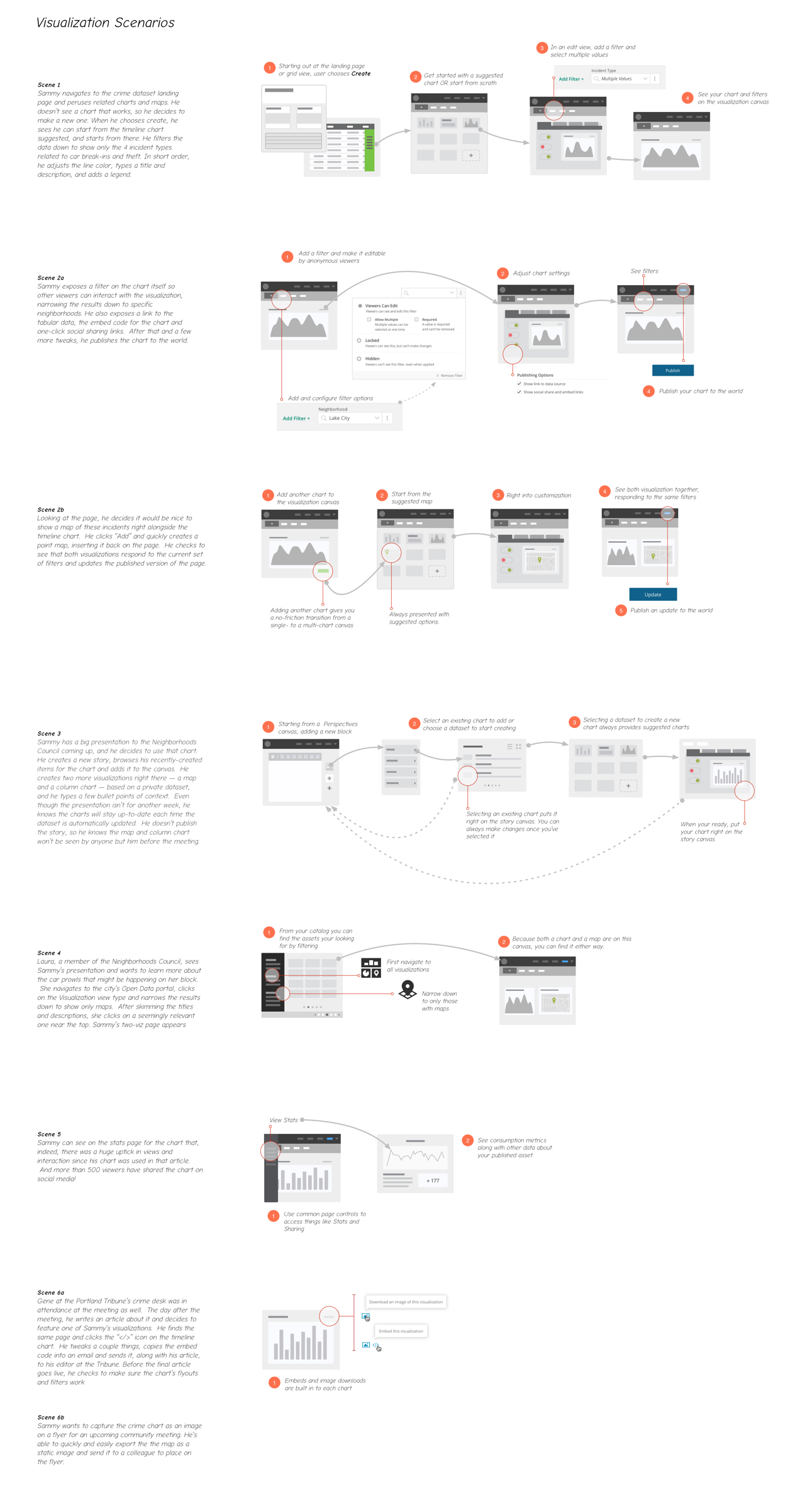
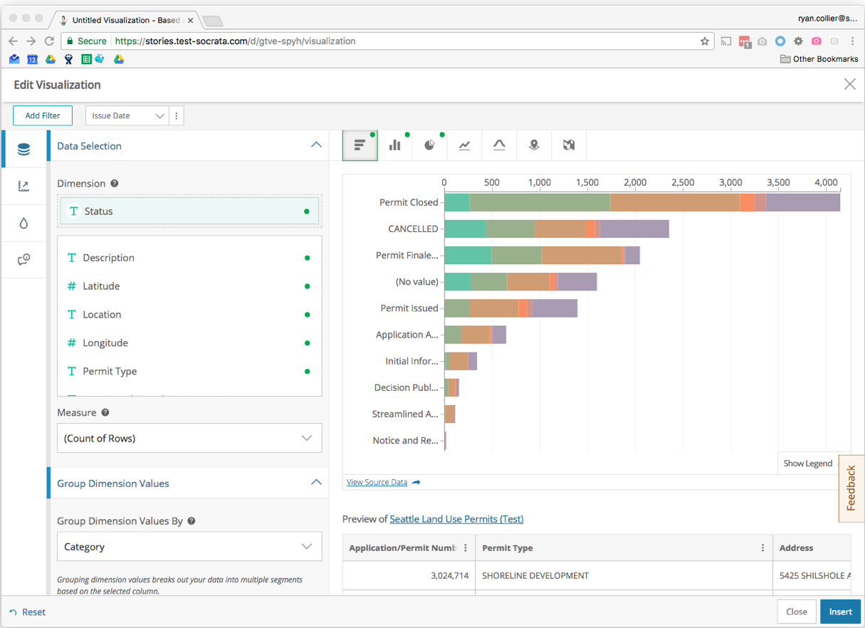
The first designs accounted for this with an authoring interface that could be launched from many Socrata platform surface areas. A user could create a standalone visualization, create a visualization on a Data Lens canvas, or within a report or story. We were able to repurpose and expand on a concept from Data Lens, the “add card dialog.”

In addition to defining where and how visualizations could be created, we had to rationalize how permissions and access worked, what kind of inheritance problems came about as a result, and how they would behave as “nested” objects in the system.
Around the same time, I also started sketching and prototyping the surface area that would be used for visualization configuration. I walked through the concepts with our team over the course of a few weeks, iterating along the way. My engineering colleague and I created a fully interactive prototype that could construct and configure a few key visualizations. This effort enabled us to invalidate our designs well before we got into the weeds.
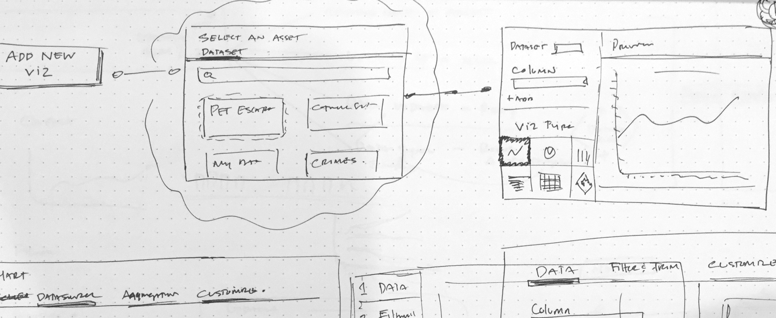
We learned quickly that our system needed to accommodate more nuance in configuration, so I re-thought the information architecture of the first designs to accommodate those new configurations. We also learned that user expectations varied a lot depending on the context and destination of the visualizations they created. This allowed us to make some trade offs that saved us a lot of time for visualizations embedded on non-Socrata pages as well as optimize the object flows we had been imagining to deliver the tech preview.
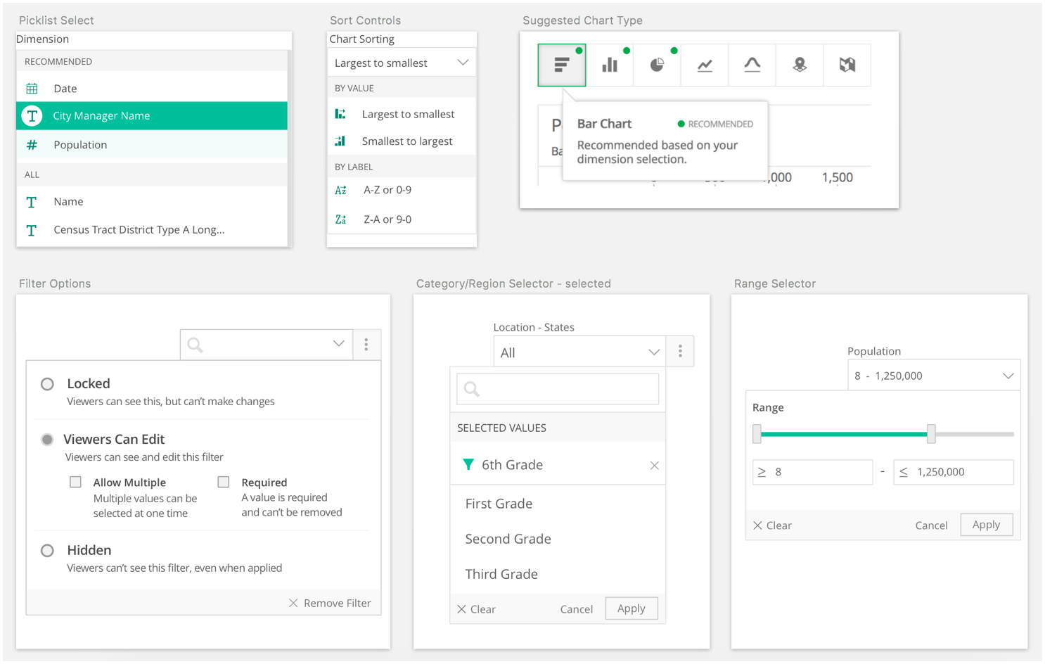
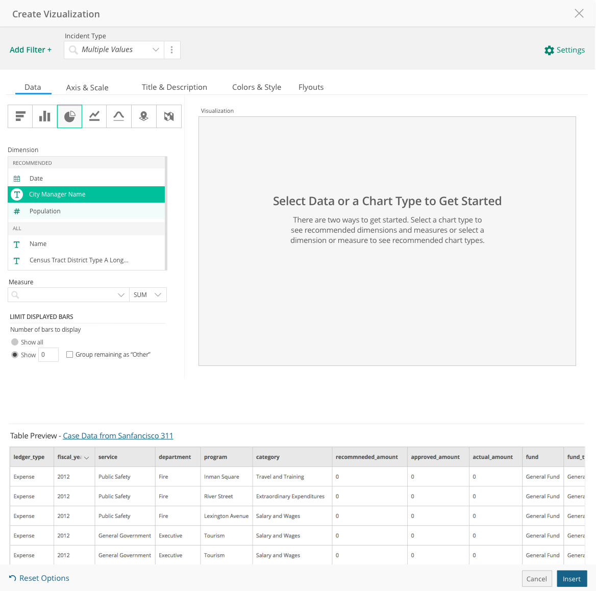
We continued to validated the need to shape data during the visualization creation process. I worked with another designer to create a set of data shaping and filtering controls that could be used alongside the visualization settings, could be selectively exposed to visualization consumers, and were included in an embedded chart object.
With a few rounds of testing and iteration behind us, we decided to closed out the prototype and built the first version of the authoring experience in earnest. After two short iterations we were able to turn on the authoring experience for users across the platform in a selective way. This meant, I could start reaching out to customers and do testing with their own data in a really easy way.
Iteration
We spent the next 3 months in a cycle of constant iteration, testing, and improvement to get to the point that we could release a tech preview.
As you can imagine, even with a small set of features, we learned a lot and found many ways to improve and change the designs. Some key things we discovered when testing in the wild were:
- Text filters need to support a full column search. There were often many (hundreds) of column values that made the control difficult to use.
- Number and range filtering needed to accommodate much more fine-grained control as well as direct input.
- Users really, really, wanted to filter and shape data, but prevent consumers from changing those filters.
- Seeing and understanding the underlying data needed to be more obvious in the context of creation.
- Resetting and re-applying configurations should be more fluid, especially as users were experimenting with their data selections.
- Many users didn’t understand some of the terminology in the experience, but were nonetheless successful in creating visualizations.
If there was anything that I could have done differently, it would have been to prioritize the “Create New” experience. I wanted to create a “bootstrap” creation flow that would “automagically” generate 8 to 10 visualizations based on our knowledge of the values and the metadata of the dataset. Users would then be able to choose from something close to what they were after. My hypothesis is that users would do much better modifying something over starting from scratch. This feature is on the team’s backlog, and I definitely hope to see it in the product someday soon.
Outcomes
We ended up getting fantastic customer reviews with this project. I spent two days observing and sharing the new authoring experience at Socrata’s annual customer summit when we launched in early March. During the sessions, one of our biggest supporters, but most vocal critics had this to say:
“Wow. Just wow. This is way better than I could have imagined and I finally ‘get’ where you are going with data visualization. I’m really looking forward to using this myself and sharing with the [open] data team.”
And another customer from the City of San Francisco said:
“We stopped training people on Socrata visualizations. It was too hard. I just gave up. But this…we can definitely use this. Thank you.”
While we are still working towards a full migration on to the new experience, users have created over 2300 visualizations with the new authoring experience.